Common Structure
View objects expose a number of fields, they are optional unless specified otherwise.
name(обязательный параметр)- only useful as a mnemonic/description of the view when looking for one in a list of some sort
model- the model linked to the view, if applicable (it doesn't for QWeb views)
priorityclient programs can request views by
id, or by(model, type). For the latter, all the views for the right type and model will be searched, and the one with the lowestprioritynumber will be returned (it is the "default view").priorityalso defines the order of application during view inheritancearch- the description of the view's layout
groups_idMany2manyfield to the groups allowed to view/use the current viewinherit_id- the current view's parent view, see Наследование., unset by default
mode- inheritance mode, see Наследование.. If
inherit_idis unset themodecan only beprimary. Ifinherit_idis set,extensionby default but can be explicitly set toprimary application- website feature defining togglable views. By default, views are always applied
Наследование.
Соответствие представления
- if a view is requested by
(model, type), the view with the right model and type,mode=primaryand the lowest priority is matched - when a view is requested by
id, if its mode is notprimaryits closest parent with modeprimaryis matched
Разрешение представления
Разрешение генерирует финальный arch для запрошенного/совпадающего primary представления:
если представление имеет предка и родительский элемент полностью опознан, тогда применяются спецификации наследования текущего представления
Если у представления нет родителя, его
archиспользуется как естьдочерние элементы текущего представления с режимом
extensionищутся, и их спецификации наследования применяются сначала в глубину (применяется дочернее представление, затем его дочерние элементы, затем его родные элементы)
Результатом применения представлений дочерних элементов является финальный вариант arch
Определение наследования
There are three types of inheritance specs:
директива
xpathс атрибутомexpr.expr- выражение XPath expression2 , примененное к текущемуarch, первый узел, который он находит и является искомым- a
fieldelement with anameattribute, matches the firstfieldwith the samename - any other element, the first element with the same name and identical
attributes (ignoring
position) is matched
Определение наследования может иметь необязательный атрибут position, определяющий, каким образом должен быть найден нужный узел для дальнейшего изменения:
inside(по умолчанию)содержимое определенного наследования добавляется к найденному узлу
replace- the content of the inheritance spec replaces the matched node
afterсодержимое определенного наследования добавляется к родительскому элементу найденного узла сразу после этого узла
beforeСодержимое определения наследования добавляется к родительскому элементу найденного узла перед ним
attributesв определении наследования должны быть элементы
attributeс атрибутомnameи содержимым, наличие которого не является обязательным:если у элемента
attributeесть содержимое, в найденном узле создается новый атрибут, после егоname, с текстом элементаattributeкак значениемесли у элемента
attributeнет тела, атрибут, указанный после егоname, удаляется из найденного узла. Если такой атрибут отсутствует, возникает ошибка
Определения представления применяются последовательно.
Lists
Корневым элементом представления List является <tree>3. Корень представления может иметь следующие атрибуты:
editableпо умолчанию выбор строки представления списка открывает соответствующее представление Form. Атрибуты
editableдают возможность редактировать данные прямо в представлении List.Допустимыми значениями являются
topиbottom, в результате чего новые записи появляются соответственно в верхней или нижней части списка.Внутреннее устройство представление Form является производным представления List. Большинство атрибутов допустимы представлением Form, и точно таким же образом, кнопки принимаются представлениями List, хотя они могут не иметь никакого значения, если представление List недоступно для редактирования
default_orderoverrides the ordering of the view, replacing the model's default order. The value is a comma-separated list of fields, postfixed by
descto sort in reverse order:<tree default_order="sequence,name desc">
colorsНе рекомендуется, начиная с версии 9.0: replaced by
decoration-{$name}fontsНе рекомендуется, начиная с версии 9.0: replaced by
decoration-{$name}decoration-{$name}позволяют изменять стиль текста строки на основе атрибутов связанной записи.
Значения - это выражения Python. Для каждой записи выражение вычисляется по атрибутам записи как значениям контекста и если вычисление возвращает
true, то соответствующий стиль применяется к строке. Другими значениями контекста являютсяuid(id текущего пользователя) иcurrent_date(текущая дата в виде строки формыyyyy-MM-dd).{$name}can bebf(font-weight: bold),it(font-style: italic), or any bootstrap contextual color (danger,info,muted,primary,successorwarning).create,edit,deleteнепозволяет изменять соответствующее действие в представлении, устанавливая нужный атрибут на
falseon_writeonly makes sense on an
editablelist. Should be the name of a method on the list's model. The method will be called with theidof a record after having created or edited that record (in database).The method should return a list of ids of other records to load or update.
stringalternative translatable label for the view
Не рекомендуется, начиная с версии 8.0: not displayed anymore
Допустимыми дочерними элементами представления List являются:
Forms
Представления Form используются для отображения данных одной записи. Их корневой элемент - <form>. Они состоит из обычного HTML с дополнительными структурными и семантическими компонентами.
Структурные компоненты
Структурные компоненты обеспечивают структуру или «визуальные» функции с небольшим количеством логики. Они используются как элементы или наборы элементов в представлениях Form.
notebookопределяет секцию с вкладками. Каждая вкладка определяется через дочерний элемент
page.pageэлементы могут иметь следующие атрибуты:string(обязательный параметр)- the title of the tab
accesskey- an HTML accesskey
attrs- standard dynamic attributes based on record values
groupиспользуется для определения расположения столбцов в представлениях Form. По умолчанию группы определяют 2 столбца, а большинство прямых потомков групп занимают один столбец. Прямые прямые потомки
fieldпо умолчанию отображают значениеlabel, аlabelиfeildимеютcolspanпо 1 каждому.Количество столбцов в
groupможно настроить с помощью атрибутаcol, количество столбцов, взятых элементом, можно настроить с помощьюcolspan.Дочерние элементы располагаются горизонтально (пытаются заполнить следующий столбец перед сменой строки).
Группы могут иметь атрибут
строка, который отображается как название группыnewlineполезен только внутри элементов
group, рано заканчивает текущую строку и сразу переключается на новую строку (без предварительного заполнения любого оставшегося столбца)separatorнебольшой горизонтальный интервал с атрибутом
stringведет себя как заголовок разделаsheetможет использоваться в качестве прямого потомка для
formпридания представлению Form более компактный вид, превращая его как бы в бумажный листheaderв сочетании с
sheet, обеспечивает область во всю ширину над основным блоком, как правило, используется для отображения кнопок рабочего процесса и виджетов состояния
Семантические компоненты
Семантические компоненты выступают в качестве связующих звеньев и позволяют взаимодействовать с системой Odoo. Допустимыми семантическими компонентами являются:
button- call into the Odoo system, similar to list view buttons
fieldrenders (and allow edition of, possibly) a single field of the current record. Possible attributes are:
name(обязательный параметр)имя отображаемого поля
widget- fields have a default rendering based on their type
(e.g.
Char,Many2one). Thewidgetattributes allows using a different rendering method and context. optionsПараметр конфигурации объекта JSON для виджета поля (включая виджеты по умолчанию)
classКласс HTML для установки на сгенерированный элемент, классы
field:oe_inlineпредотвратить обычный разрыв строки после полей
oe_left,oe_rightfloats это свойство CSS будет применено к полю с соответствующим направлением
oe_read_only,oe_edit_onlyотображает поле только в соответствующем режиме формы
oe_no_button- avoids displaying the navigation button in a
Many2one oe_avatarдля полей изображений, отображает изображения как аватары (имеет форму квадрата, максимальный размер 90x90 и некоторые декораторы)
groupsотображает поле только для определенных пользователей
on_changeвызывает указанный метод, когда значение этого поля редактируется, может генерировать обновления других полей или отображать предупреждения для пользователя
Не рекомендуется, начиная с версии 8.0: Use
openerp.api.onchange()on the modelattrsдинамические мета-параметры, основанные на значениях записи
domainтолько для реляционных полей, фильтры, применяемые при отображении существующих записей
contextтолько для реляционных полей, контекст для запроса возможных значений
readonlyОтображать поле как в режиме только для чтения, так и в режиме редактирования, но никогда не позволяет редактировать его самого
requiredгенерирует ошибку и предотвращает сохранение записи, если поле не имеет значения
nolabelне отображать метку поля автоматически, имеет смысл только в том случае, если поле является прямым потомком элемента
groupplaceholderпоказывает вспомогательное сообщение пустых полях. Может заменять метки полей в сложных формах. Не должны быть похожи на уже введенные данные , так как пользователи могут путать текст заполнитель с заполненными полями
mode- for
One2many, display mode (view type) to use for the field's linked records. One oftree,form,kanbanorgraph. The default istree(a list display) helpПодсказка, отображаемая для пользователей при наведении курсора на поле или его метку
filenameдля полей с типом binary, имя поля, предоставляющего имя файла
password- indicates that a
Charfield stores a password and that its data shouldn't be displayed
Business Views guidelines
Business views are targeted at regular users, not advanced users. Examples are: Opportunities, Products, Partners, Tasks, Projects, etc.
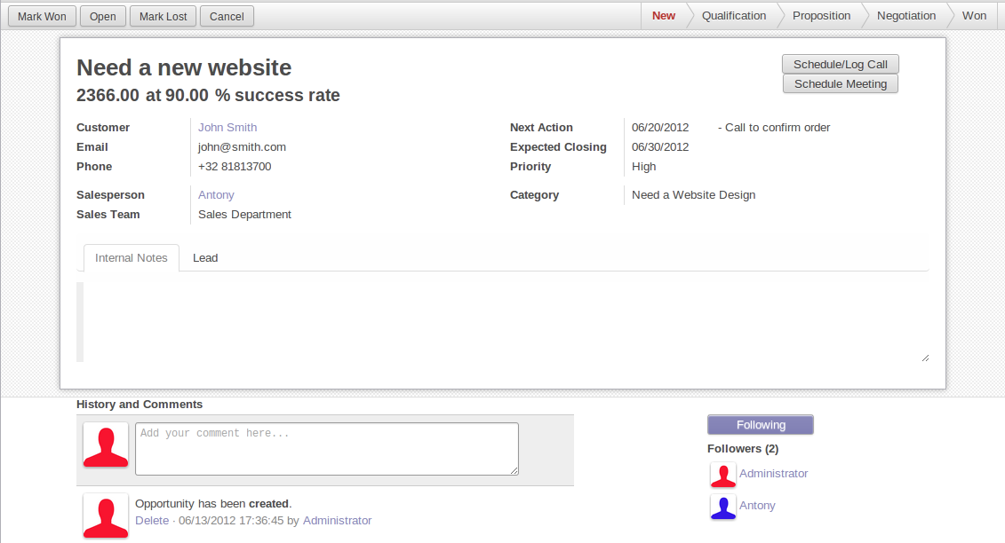
In general, a business view is composed of
- a status bar on top (with technical or business flow),
- a sheet in the middle (the form itself),
- a bottom part with History and Comments.
Technically, the new form views are structured as follows in XML:
<form>
    <header> ... content of the status bar  ... </header>
    <sheet>  ... content of the sheet       ... </sheet>
    <div class="oe_chatter"> ... content of the bottom part ... </div>
</form>
The Status Bar
The purpose of the status bar is to show the status of the current record and the action buttons.

The Status
Uses the statusbar widget, and shows the current state in red. States
common to all flows (for instance, a sale order begins as a quotation, then we
send it, then it becomes a full sale order, and finally it is done) should be
visible at all times but exceptions or states depending on particular sub-flow
should only be visible when current.


The states are shown following the order used in the field (the list in a
selection field, etc). States that are always visible are specified with the
attribute statusbar_visible.
<field name="state" widget="statusbar"
    statusbar_visible="draft,sent,progress,invoiced,done" />
The Sheet
All business views should look like a printed sheet:
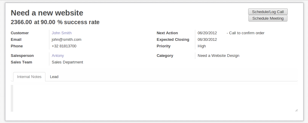
- Elements inside a
<form>or<page>do not define groups, elements inside them are laid out according to normal HTML rules. They content can be explicitly grouped using<group>or regular<div>elements. - By default, the element
<group>defines two columns inside, unless an attributecol="n"is used. The columns have the same width (1/n th of the group's width). Use a<group>element to produce a column of fields. To give a title to a section, add a
stringattribute to a<group>element:<group string="Time-sensitive operations">
this replaces the former use of
<separator string="XXX"/>.- The
<field>element does not produce a label, except as direct children of a<group>element1. Use<label for="field_name>to produce a label of a field.
Sheet Headers
Some sheets have headers with one or more fields, and the labels of those fields are only shown in edit mode.
| View mode | Edit mode |
|---|---|
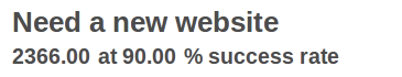 | 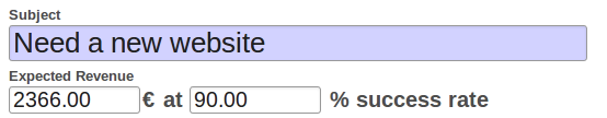 |
Use HTML text, <div>, <h1>, <h2>… to produce nice headers, and
<label> with the class oe_edit_only to only display the field's label
in edit mode. The class oe_inline will make fields inline (instead of
blocks): content following the field will be displayed on the same line rather
than on the line below it. The form above is produced by the following XML:
<label for="name" class="oe_edit_only"/>
<h1><field name="name"/></h1>

<label for="planned_revenue" class="oe_edit_only"/>
<h2>
    <field name="planned_revenue" class="oe_inline"/>
    <field name="company_currency" class="oe_inline oe_edit_only"/> at
    <field name="probability" class="oe_inline"/> % success rate
</h2>
Button Box
Many relevant actions or links can be displayed in the form. For example, in Opportunity form, the actions "Schedule a Call" and "Schedule a Meeting" have an important place in the use of the CRM. Instead of placing them in the "More" menu, put them directly in the sheet as buttons (on the top) to make them more visible and more easily accessible.

Technically, the buttons are placed inside a <div> to group them as a
block on the top of the sheet.
<div class="oe_button_box" name="button_box">
    <button string="Schedule/Log Call" name="..." type="action"/>
    <button string="Schedule Meeting" name="action_makeMeeting" type="object"/>
</div>
Groups and Titles
A column of fields is now produced with a <group> element, with an
optional title.
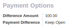
<group string="Payment Options">
    <field name="writeoff_amount"/>
    <field name="payment_option"/>
</group>
It is recommended to have two columns of fields on the form. For this, simply
put the <group> elements that contain the fields inside a top-level
<group> element.
To make view extension simpler, it is
recommended to put a name attribute on <group> elements, so new fields
can easily be added at the right place.
Special Case: Subtotals
Some classes are defined to render subtotals like in invoice forms:
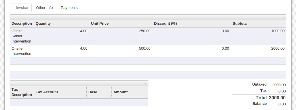
<group class="oe_subtotal_footer">
    <field name="amount_untaxed"/>
    <field name="amount_tax"/>
    <field name="amount_total" class="oe_subtotal_footer_separator"/>
    <field name="residual" style="margin-top: 10px"/>
</group>
Placeholders and Inline Fields
Sometimes field labels make the form too complex. One can omit field labels, and instead put a placeholder inside the field. The placeholder text is visible only when the field is empty. The placeholder should tell what to place inside the field, it must not be an example as they are often confused with filled data.
One can also group fields together by rendering them "inline" inside an
explicit block element like <div>. This allows grouping semantically
related fields as if they were a single (composite) fields.
The following example, taken from the Leads form, shows both placeholders and inline fields (zip and city).
| Edit mode | View mode |
|---|---|
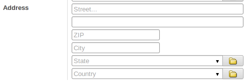 | 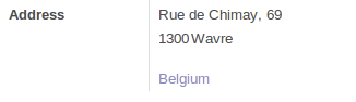 |
<group>
    <label for="street" string="Address"/>
    <div>
        <field name="street" placeholder="Street..."/>
        <field name="street2"/>
        <div>
            <field name="zip" class="oe_inline" placeholder="ZIP"/>
            <field name="city" class="oe_inline" placeholder="City"/>
        </div>
        <field name="state_id" placeholder="State"/>
        <field name="country_id" placeholder="Country"/>
    </div>
</group>
Images
Images, like avatars, should be displayed on the right of the sheet. The product form looks like:
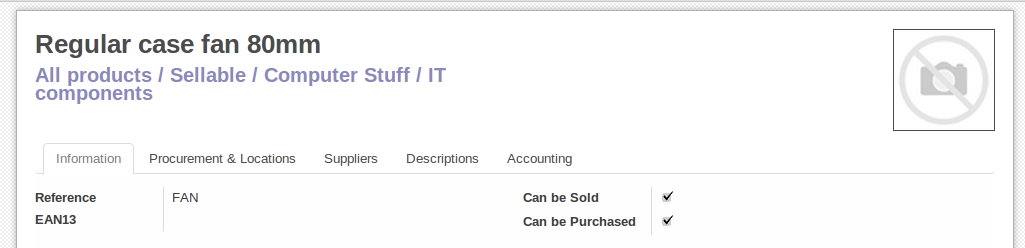
The form above contains a <sheet> element that starts with:
<field name="product_image" widget="image" class="oe_avatar oe_right"/>
Tags
Most Many2many fields, like categories, are better
rendered as a list of tags. Use the widget many2many_tags for this:
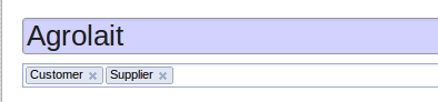
<field name="category_id" widget="many2many_tags"/>
Configuration forms guidelines
Examples of configuration forms: Stages, Leave Type, etc. This concerns all menu items under Configuration of each application (like Sales/Configuration).
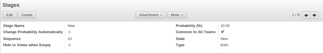
- no header (because no state, no workflow, no button)
- no sheet
Dialog forms guidelines
Example: "Schedule a Call" from an opportunity.
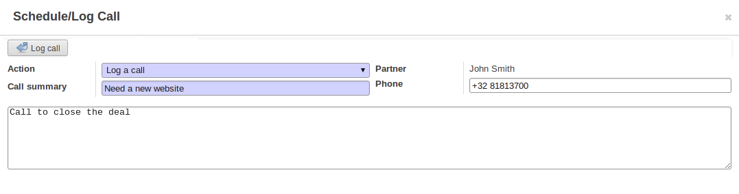
- avoid separators (the title is already in the popup title bar, so another separator is not relevant)
- avoid cancel buttons (user generally close the popup window to get the same effect)
- action buttons must be highlighted (red)
- when there is a text area, use a placeholder instead of a label or a separator
- like in regular form views, put buttons in the <header> element
Configuration Wizards guidelines
Example: Settings / Configuration / Sales.
- always in line (no popup)
- no sheet
- keep the cancel button (users cannot close the window)
- the button "Apply" must be red
Graphs
Представление Graph используется для визуализации сводных данных по нескольким записям или группам записей. Его корневым элементом является [UNKNOWN NODE problematic]<graph> [UNKNOWN NODE problematic], который может принимать следующие атрибуты:
typeкаждое из этих значений
bar(по умолчанию),pieиline, это тип используемого графикаstackedиспользуется только для графика с типом
bar. Если таковой тип присутствует установлен вTrue, то колонки будут объеденены в группы
Единственным допустимым элементом в представлении Graph является field, которое может иметь следующие атрибуты:
name(обязательный атрибут)- the name of a field to use in a graph view. If used for grouping (rather than aggregating)
typeуказывает, должно ли поле использоваться как критерий группировки или как агрегированное значение внутри группы. Возможные значения:
row(по умолчанию)- groups by the specified field. All graph types support at least one level of grouping, some may support more. For pivot views, each group gets its own row.
col- only used by pivot tables, creates column-wise groups
measureполе для агрегирования внутри группы
intervalприменяется к
dateиdatetimeполям, группирует по указанным интервалам (day,week,month,quarterилиyear)вместо группировки по указанному времени (фиксированные значения секунд) или дате (фиксированные значения дней).
Предупреждение
агрегирование представлений Graph выполняется по содержимому базы данных, не сохраняемые поля функций нельзя использовать в представлениях Graph
Pivots
Представление Pivot используется для визуализации объединенных данных как pivot таблицы. Его корневым элементом является <pivot>, который может принимать следующие атрибуты:
disable_linkingУстановите
True, чтобы удалить ссылки ячеек таблицы на представление List.display_quantityУстановите
true, чтобы отображать колонку количества по умолчанию.
The elements allowed within a pivot view are the same as for the graph view.
Kanban
Представление Kanban являет собой визуализацию канбан доску: она отображает записи как « карты», и призваны заполнить промежуточную нишу между представлением List и нередактируемым представлением Form. Записи могут быть сгруппированы в столбцы для использования для визуализации рабочего процесса или в его манипуляции (например для отображения задач или управления прогрессом работ) или не группироваться (используются просто для визуализации записей).
Корневым элементом представления Kanban является <kanban>, он может использовать следующие атрибуты:
default_group_byуказывает на то, следует ли группировать представление Kanban, если группировка не указана с помощью действия или текущего поиска. Должно быть именем поля, по которому нужно группировать, если никакая другая группировка не указана
default_orderпорядок сортировки карточек, если пользователь еще не отсортировал записи (через представление List)
classдобавляет HTML-классы к корневому элементу HTML представления Kanban
quick_createwhether it should be possible to create records without switching to the form view. By default,
quick_createis enabled when the Kanban view is grouped, and disabled when not.Установите
trueчтобы всегда разрешать, иfalseвсегда отключать.
Допустимые дочерние элементы представления:
fieldобъявляет поля для агрегирования или для использования в kanban [UNKNOWN NODE problematic]логике [UNKNOWN NODE problematic]. Если поле просто отображается в представлении Kanban, его не нужно предварительно объявлять.
Допустимые атрибуты:
name(обязательный атрибут)имя требуемого поля
templatesопределяет список QWeb шаблонов. Определение карточек может быть разбито на несколько шаблонов для большей наглядности, но представления Kanban должны определять хотя бы один корневой шаблон
kanban-box, который будет отображаться один раз для каждой записи.Представление Kanban использует в основном javascript qweb и предоставляет следующие контекстные переменные:
instance- the current Web Client instance
widgetтекущий класс
KanbanRecord(), может быть испльзован для доступа к мета-информации. Эти методы так же доступны прямо из контекста шаблона и не требуют доступа черезwidgetrecord- an object with all the requested fields as its attributes. Each field has
two attributes
valueandraw_value, the former is formatted according to current user parameters, the latter is the direct value from aread()(except for date and datetime fields that are formatted according to user's locale) formats- the
web.formats()module to manipulate and convert values read_only_modeназвание говорит само за себя
Кнопки и поля
Пока большинство Kanban шаблонов это стандартный QWeb, представление Kanban специальные элементы
field,buttonиa:- by default fields are replaced by their formatted value, unless they match specific kanban view widgets
кнопки и ссылки с атрибутом
typeстали выполнять операции, связанные с Odoo, а не их стандартную функцию HTML. Возможные типы:action,objectстандартное поведение для Odoo buttons, можно использовать большинство атрибутов, относящихся к стандартным кнопкам Odoo.
openоткрывает запись карточки в представлении Form в режиме только для чтения
editоткрывает запись карты в представлении Form в редактируемом режиме
deleteудаляет запись карты и удаляет карту
API Javascript
class KanbanRecord()
Widget() handling the rendering of a single record to a
card. Available within its own rendering as widget in the template
context.
kanban_color(raw_value)
Converts a color segmentation value to a kanban color class
oe_kanban_color_color_index. The built-in CSS provides classes
up to a color_index of 9.
kanban_getcolor(raw_value)
Converts a color segmentation value to a color index (between 0 and 9 by default). Color segmentation values can be either numbers or strings.
kanban_image(model, field, id[, cache][, options])
Generates the URL to the specified field as an image access.
- model (
String) -- model hosting the image - field (
String) -- name of the field holding the image data - id -- identifier of the record contaning the image to display
- cache (
Number) -- caching duration (in seconds) of the browser default should be overridden.0disables caching entirely
kanban_text_ellipsis(string[, size=160])
clips text beyond the specified size and appends an ellipsis to it. Can be used to display the initial part of potentially very long fields (e.g. descriptions) without the risk of unwieldy cards
Calendar
Представление Calendar записи как события в однодневном, недельном или месячном календарях. Его корневым элементом является <calendar>. Допустимыми атрибутами в представлении Calendar являются:
date_start(обязательный атрибут)имя поля записи, содержащее дату начала события
date_stopимя поля записи, содержащее дату окончания события, если указана
date_stop, записи становятся подвижными (с помощью перетаскивания) непосредственно в представлении Calendardate_delay- alternative to
date_stop, provides the duration of the event instead of its end date color- name of a record field to use for color segmentation. Records in the same color segment are allocated the same highlight color in the calendar, colors are allocated semi-randomly.
event_open_popup- opens the event in a dialog instead of switching to the form view, disabled by default
quick_addвключает быстрое создание событий при клике: запрашивает у пользователя
nameи пытается создать новое событие именно с тем временем, куда был произведен клик. Возвращается к вышеописанному диалоговому окну, если быстрое создание не удалось выполнитьdisplay- format string for event display, field names should be within brackets
[and] all_dayимя поля типа Boolean, указывающее, отмечено ли соответствующее событие как занимающее целый день (продолжительность не имеет значения)
modeРежим отображения по умолчанию при загрузке представления Calendar. Допустимые атрибуты:
day,week,month
Gantt
Представления Gantt предназначены для формирования диаграмм Ганта (они, как правило, применяются для планирования).
Корневым элементом представлений Gantt является [UNKNOWN NODE problematic]<gantt /> [UNKNOWN NODE problematic], у него нет потомков, но он может принимать следующие атрибуты:
date_start(обязательный атрибут)Имя поля, указывающего на дату начала события для каждой записи.
date_stopname of the field providing the end duration of the event for each record. Can be replaced by
date_delay. One (and only one) ofdate_stopanddate_delaymust be provided.If the field is
Falsefor a record, it's assumed to be a "point event" and the end date will be set to the start datedate_delay- name of the field providing the duration of the event
duration_unit- one of
minute,hour(default),day,week,month,year default_group_byимя поля для группировки задач
typeganttclassic gantt view (default)consolidatevalues of the first children are consolidated in the gantt's taskplanningchildren are displayed in the gantt's taskconsolidationимя поля для отображения значения консолидации в ячейке записи
consolidation_maxdictionary with the "group by" field as key and the maximum consolidation value that can be reached before displaying the cell in red (e.g.
{"user_id": 100})Предупреждение
The dictionnary definition must use double-quotes,
{'user_id': 100}is not a valid valueconsolidation_label- string to display next to the consolidation value, if not specified, the label of the consolidation field will be used
fold_last_level- If a value is set, the last grouping level is folded
round_dnd_dates- enables rounding the task's start and end dates to the nearest scale marks
Diagram
Представление Diagram может использоваться для отображения ориентированных графов записей. Корневой элемент <diagram> и не имеет атрибутов.
Допустимые дочерние элементы представления Ddiagram:
node(обязательный параметр, 1)Определяет узлы графа. Его атрибуты:
objectузел модели Odoo
shapeУсловное сопоставление фигуры с цветами и шрифтами в the list view. Единственной допустимой фигурой является
rectangle(фигура по умолчанию - элипс)bgcolorтоже что и
shape, но условно сопостявляет фоновый цвет для узлов. По умолчанию цвет фона - белый, единственной допустимой альтернативой являетсяgrey.
arrow(обязательный параметр, 1)Определяет направленные ребра графа. Его атрибуты:
object(обязательный параметр)Модель Odoo в качестве ребра
source(обязательный параметр)Many2onefield of the edge's model pointing to the edge's source node recorddestination(обязательный параметр)Many2onefield of the edge's model pointing to the edge's destination node recordlabelСписок атрибутов Python (в виде цитируемых строк). Соответствующие значения атрибутов будут объединены и отображены как метка ребра
labelПримечание для диаграммы, атрибут
stringопределяет содержание примечания. Каждаяlabelвыводится как параграф в заголовке диаграммы.
Search
Представления Search отличаются от предыдущих типов представлений тем, что они не отображают [UNKNOWN NODE problematic]content [UNKNOWN NODE problematic]: хотя они применяются к определенной модели, они используются для фильтрации содержимого другого представления (как правило, е представления-агрегаторы, например Lists or Graphs). Не смотря на это различие, они определяются одинаково.
Корневым элементом представлений поиска является <search>. Он не принимает атрибутов.
Допустимые дочерние элементы в представлении Search:
fieldПоля определяют домены или контексты со значениями, который вводят пользователи. Когда создаются поисковые домены, домены полей составляются друг с другом и с фильтрами, используя оператор AND.
Поля могут иметь следующие атрибуты:
nameимя поля для фильтрации
stringописание поля
operatorпо умолчанию, поля генерируют домен по следующему шаблону
[(name, operator, provided_value)]гдеnameимя поляprovided_valueзначение предоставленное пользователем, возможно отфильтрованный или преобразованный (например, ожидается, что пользователь предоставит метку значения поляselection, а не само значение).Атрибут
operatorпозволяет переопределять оператор по умолчанию, который зависит от типа поля (например,=для полей с типомfloat, ноilikeдля полей с типомchar)filter_domainполный домен, который можно использовать в качестве домена поиска поля, может использовать переменную
selfдля вставки предоставленного значения в пользовательский домен. Может использоваться для генерации значительно более гибких доменов, чем только «оператор» (например, поиск по нескольким полям одновременно)Если указаны оба
operator, иfilter_domain, то приоритет имеетfilter_domain.contextallows adding context keys, including the user-provided value (which as for
domainis available as aselfvariable). By default, fields don't generate domains.Примечание
the domain and context are inclusive and both are generated if if a
contextis specified. To only generate context values, setfilter_domainto an empty list:filter_domain="[]"groupsсделать поле доступным только для определенных пользователей
widget- use specific search widget for the field (the only use case in
standard Odoo 8.0 is a
selectionwidget forMany2onefields) domain- if the field can provide an auto-completion
(e.g.
Many2one), filters the possible completion results.
filterфильтр - это предопределенный переключатель в представлении Search, его можно включить или отключить. Его основная цель добавление данных в контекст поиска (контекст, передаваемый в представление данных для поиска/фильтрации), или для добавления новых разделов в фильтр поиска.
Фильтры могут иметь следующие атрибуты:
string(обязательный параметр)описание фильтра
domain- an Odoo domain, will be appended to the action's domain as part of the search domain
contextсловарь Python, объединенный с доменом действия для создания домена поиска
nameлогическое имя фильтра, может использоваться для включить его по умолчанию, также может использоваться как hook наследования
helpболее длинный пояснительный текст для фильтра, может отображаться в виде всплывающей подсказки
groupsделает фильтр доступным только для определенных пользователей
Совет
Добавлено в версии 7.0.
Последовательности фильтров (без разделения) рассматриваются как включенные композиции: они будут состоять из операторов
ИЛИ, а не обычногоИ.<filter domain="[('state', '=', 'draft')]"/> <filter domain="[('state', '=', 'done')]"/>
Если выбраны оба фильтра, выберет записи,
stateкоторых равенdraftилиdone, но<filter domain="[('state', '=', 'draft')]"/> <separator/> <filter domain="[('delay', '<', 15)]"/>
если выбраны оба фильтра, выберет записи,
stateкоторых являетсяdraftиdelayменьше чем 15.separatorможет использоваться для разделения групп фильтров в простых представлениях Search
groupможет использоваться для разделения групп фильтров, более читаемых, чем
separatorв сложных представлениях Search
Значения Search по умолчанию
Search fields and filters can be configured through the action's context
using search_default_name keys. For fields, the value should be the
value to set in the field, for filters it's a boolean value. For instance,
assuming foo is a field and bar is a filter an action context of:
{
  'search_default_foo': 'acro',
  'search_default_bar': 1
}
автоматически активирует фильтр bar и ищет поле foo для acro.
QWeb
QWeb views are standard QWeb templates inside a view's
arch. They don't have a specific root element.
A QWeb view can only contain a single template4, and the template's name must match the view's complete (including module name) external id.
template should be used as a shortcut to define QWeb views.
добавлена функция расширения для более простого поиска в представлениях QWeb: hasclass(*classes) узел будет попадать под выборку, если он узел имеет все указанные классы
По историческим причинам он имеет свое происхождение из древовидных представлений, позже переориентированных на отображение большего таблиц/списков